Creating a React Component Library using Rollup, Typescript, Sass and Storybook
At work we have a number of front-end projects that are worked on by different project teams. Each of these projects are designed by our internal designer and had a lot common with them (same inputs, buttons designs etc). Up until now, we had no shared style-sheets or components. Components across projects were created from scratch, rewritten or copy pasted over each time. I saw a real need for an internal component library. This component library would enable teams to pull down an NPM package, import components, provide some props and have their components ready to use.
I strongly believed the component would help speed up front-end development by removing the need to write/copy paste components over to new projects. I thought it would also be great to learn how to create, manage and help adopt a component library used in production across multiple engineering teams and projects. So I created a React component library!
I wrote this article to share my experience around researching and building the component library. It''ll also cover how you can build your own React component library!
Table of Contents
Component Library Overview
There were a number of requirements I had for the component library. Those requirements being that it should:
- Use React
- Use Sass
- Use TypeScript (and bundle/export TypeScript types)
- House a number of components
- Have each component thoroughly tested (using Jest/React Testing Library)
- Bundle and transpile the components and be able to be published to an internal (or external) NPM registry as a single package
- Have components that are able to be displayed and interacted with on an internal (or external) website without having to set the library up locally
- Be versionable using Semantic Versioning
Just give me the component library code!
Sometimes it's just easier to clone a repository as opposed to following along with the article creating everything from scratch, I get it. For your convenience I've created a GitHub repository which has all the configuration needed for creating your own component library:

I've created branches for different variants of the component library that people have requested:
Give it a star if it helps you out :). If you feel like it can be improved, please raise a pull request or a GitHub issue!
Component Library Research
Existing Component Libraries
Before I created our own component library, I had a look around to see what other React component libraries were out there and whether we could use them. Turns out there's quite a few great libraries such as:
Our designer had created the designs for our components with specific styles that none of these libraries could easily achieve without us going into the internals of the components and altering them. So I decided it would be better to create our own components.
Component Library Creation Tools
I then had a look around at a number of React project skeletons I could use to bootstrap the component library. Here are the libraries I considered:
- Create React App - "Set up a modern web app by running one command"
- Create React Library - "CLI for creating reusable react libraries"
- NWB - "a toolkit for React, Preact, Inferno & vanilla JS apps, React libraries and other npm modules for the web"
All of these libraries had excellent documentation, support and a number of features that made it easy to get different flavours of React project/libraries up and running. But there was always an issue I ran into that hindered my ability to configure the library to meet my requirements (since they abstracted config away).
Create React App is designed for creating a web application, not a library. NWB was promising, but didn't have great support for TypeScript when I used it. Create React Library had inflexible config, making it tricky to get my library transforming and bundling the Sass files correctly.
Due to all the above not matching the requirements I had for the component library, I decided to write all the config from scratch! This approach gave me with much more control around the config of the project.
Custom Library Technology Choices
Before I began building out the React component library, I needed to choose the languages and libraries to use to build the library. As you've seen in the article's title, I've chosen TypeScript, Sass, Rollup and Storybook. Here's my rationale behind choosing them.
TypeScript
TypeScript is my go to language for all my front-end projects. TypeScript provides type safety over your functions (and components). I've found that this type safety has helped me:
- Catch runtime errors at compile time
- Understand how to use functions/components without looking at the code itself
- Write code quicker (thanks to my IDE's autocomplete)
- Refactor code faster and with more confidence
- Write code that is easier to read and understand
Building the component library using TypeScript allows you to easily bundle the types of your components for no extra work! Anyone who is using TypeScript and installs/uses the library will be eternally grateful to you (it is also kind of expected nowadays).
There is an overhead of creating types/interfaces for all your functions/components, but it is something that will save you ALOT of time later down the track.
Sass
Sass is my go to library for writing CSS. It's a CSS pre-processor that augments CSS with a number of handy features. It allows you to write CSS with variables, nesting, mixins, loops, functions, imports and more! The features I use most are variables and nesting.
Sass has always helped me write CSS faster, that's less verbose, is more maintainable and with less repetition.
If you don't want to use Sass, I'll also be showing you how to use CSS Modules, LESS, or Stylus to build your component library.
If you want to use styled-components, check out this branch of my component library repo.
Rollup
My decision for a JavaScript module bundler to use was between Webpack and Rollup. I decided to use Rollup for the component library after researching what the differences between Webpack and Rollup are. This article goes into depth about these differences. The take-home is that:
Use Webpack for apps, and Rollup for libraries
This isn't a hard and fast rule, it's more of a guideline (which I have opted to follow). Rollup can be used to build apps and Webpack can be used to build libraries.
I also recommend reading this Medium article and this Stack Overflow post that further discuss the difference between Rollup and Webpack.
Storybook
I found out about Storybook in an interview I had with a web agency a few years ago. They explained they were using Storybook to help them create, experiment and display their React components. After the interview, I did my own research and experimentation with Storybook and fell in love with the tool. Storybook felt like a perfect fit for the component library.
Storybook provides a sand-boxed environment for your front-end projects that helps you to develop your components in isolation. The sandbox environment encourages engineers to create components that aren't tied in with logic within your application (e.g. coupled with and reliant on a Redux store). This results in components that are more generic and more re-usable.
Storybook also has the ability to be exported as a static webpage. You can easily host these files which will allow everyone in your organisation to see how components look/interact without having to clone and setup the repository locally. This is perfect to help out our product manager and designer friends!
For example, I've exported the component library Storybook files built in this article and currently host it on my Express server here. Here it is in an iframe:
Creating the Component Library
First, we have to initialise NPM (npm init), set the name field to react-component-library and initialise Git (git init).
We're creating a React component library and need React to help us build our components:
npm i --save-dev react react-dom @types/reactWe will also configure react and react-dom as Peer Dependencies. Having them as peer dependencies will mean that once our library is installed in another project, they won't be automatically installed as dependencies. Instead, NPM will provide soft assertion by outputting a warning if a matching version of the dependencies haven't been installed alongside our component library.
We will later introduce a Rollup plugin called rollup-plugin-peer-deps-external. This plugin prevents packages listed in peerDependencies from being bundled with our component library (reducing our bundle size by 109kb).
Create an entry in package.json called peerDependencies and add react and react-dom. I've specified the version target as >=16.8.0 as we want a version of React that supports React Hooks (released in 16.8.0):
...
"peerDependencies": {
  "react": ">=16.8.0",
  "react-dom": ">=16.8.0"
}
...Now let's create the skeleton of our library by creating the following files and directories:
.storybook/
  main.js
.gitignore
package.json
rollup.config.js
tsconfig.json
jest.config.js
jest.setup.ts
src/
  TestComponent/
    TestComponent.tsx
    TestComponent.types.ts
    TestComponent.scss
    TestComponent.stories.tsx
    TestComponent.test.ts
  index.ts
We will output our transpiled, bundled files within a build directory.
In TestComponent.tsx we will have a very simple component:
import React from "react";

import { TestComponentProps } from "./TestComponent.types";

import "./TestComponent.scss";

const TestComponent: React.FC<TestComponentProps> = ({ theme }) => (
  <div
    data-testid="test-component"
    className={`test-component test-component-${theme}`}
  >
    <h1 className="heading">I'm the test component</h1>
    <h2>Made with love by Harvey</h2>
  </div>
);

export default TestComponent;
With the prop types imported from and defined in TestComponent.types.ts:
export interface TestComponentProps {
  theme: "primary" | "secondary";
}
And in TestComponent.scss we will have:
.test-component {
    background-color: white;
    border: 1px solid black;
    padding: 16px;
    width: 360px;
    text-align: center;

    .heading {
        font-size: 64px;
    }

    &.test-component-secondary {
        background-color: black;
        color: white;
    }
}src/index.ts will be used as the entry point for Rollup. We will use a pattern called Barrel Exports to expose our components in the entry point. We do this by importing, then exporting all our components. Components exported here will be bundled by Rollup. In this file add:
import TestComponent from "./TestComponent/TestComponent";

export { TestComponent };
We will leave TestComponent.stories.js and TestComponent.test.tsx empty for now.
Adding TypeScript
Run npm i -D typescript and in tsconfig.json add:
{
  "compilerOptions": {
    "declaration": true,
    "declarationDir": "build",
    "module": "esnext",
    "target": "es5",
    "lib": ["es6", "dom", "es2016", "es2017"],
    "sourceMap": true,
    "jsx": "react",
    "moduleResolution": "node",
    "allowSyntheticDefaultImports": true,
    "esModuleInterop": true
  },
  "include": ["src/**/*"],
  "exclude": [
    "node_modules",
    "build",
    "src/**/*.stories.tsx",
    "src/**/*.test.tsx"
  ]
}
This is the config I recommend using. It's important to take note of "declaration": true and "declarationDir": "build". This will generate and place the types of our components within our build folder. Feel free to adjust this config to your liking.
Adding Rollup
Now we need to install Rollup in addition to some plugins required for our component library to be transpiled and bundled correctly:
npm i -D rollup rollup-plugin-typescript2 @rollup/plugin-commonjs @rollup/plugin-node-resolve rollup-plugin-peer-deps-external rollup-plugin-postcss node-sassIn rollup.config.js add:
import peerDepsExternal from "rollup-plugin-peer-deps-external";
import resolve from "@rollup/plugin-node-resolve";
import commonjs from "@rollup/plugin-commonjs";
import typescript from "rollup-plugin-typescript2";
import postcss from "rollup-plugin-postcss";

const packageJson = require("./package.json");

export default {
  input: "src/index.ts",
  output: [
    {
      file: packageJson.main,
      format: "cjs",
      sourcemap: true
    },
    {
      file: packageJson.module,
      format: "esm",
      sourcemap: true
    }
  ],
  plugins: [
    peerDepsExternal(),
    resolve(),
    commonjs(),
    typescript({ useTsconfigDeclarationDir: true }),
    postcss()
  ]
};
Lets run through the everything in this config file.
input
points to src/index.ts. Rollup will build up a dependency graph from this entry point and then bundle all the components that are imported/exported.
output
is an array with two objects, each specifying output config. We will be outputting two bundles in two different JavaScript module formats:
- CommonJS - CJS
- ES Modules - ESM
This is because we want to support tools that use CommonJS (Webpack, Node.js) and tools that work with ES Modules (Webpack 2+, Rollup). Read more about CJS, ESM and other output formats in Rollup's documentation.
ES Modules have a static module structure. This enables bundling tools that target ESM to perform tree shaking. Tree shaking is a process of dead code elimination where Bundlers will attempt to only bundle code that is being used.
CommonJS modules have a dynamic module structure. This makes it difficult for bundling tools that target CommonJS to perform tree shaking. This means that even if only one component is imported from our library, all components will be bundled.
Read more about CJS, ESM and tree shaking here.
We will import the filename of our desired CommonJS and ES Modules index file from package.json. The main field in package.json points to our bundled CommonJS entry point and the module field points to our bundled ES Modules entry point.
If a tool can support ESM, it'll use module otherwise it'll use main.
We will be outputting all our bundles to the build directory. Add the main and module fields in package.json in addition to the files field to instruct NPM what files to include when our component library is installed as a dependency:
...
"main": "build/index.js",
"module": "build/index.es.js",
"files": ["build"],
...plugins
is an array of 3rd party Rollup plugins. The plugins I've included are ones that are required to bundle the component library. A complete list of plugins can be found here. Let's go through all the plugins we're using:
- peerDepsExternal (
rollup-plugin-peer-deps-external) - prevents Rollup from bundling the peer dependencies we've defined inpackage.json(reactandreact-dom) - resolve (
@rollup/plugin-node-resolve) - efficiently bundles third party dependencies we've installed and use innode_modules - commonjs (
@rollup/plugin-commonjs) - enables transpilation into CommonJS (CJS) format - typescript (
rollup-plugin-typescript2) - transpiles our TypeScript code into JavaScript. This plugin will use all the settings we have set intsconfig.json. We set"useTsconfigDeclarationDir": trueso that it outputs the.d.tsfiles in the directory specified by intsconfig.json - postcss (
rollup-plugin-postcss) - transforms our Sass into CSS. In order to get this plugin working with Sass, we've installednode-sass. It also supports CSS Modules, LESS and Stylus. I recommend reading the documentation here if you want to use a different CSS pre-processor and/or to learn all the other settings available.
Other useful plugins you might want to add are:
- @rollup/plugin-images - import image files into your components
- @rollup/plugin-json - import JSON files into your components
- rollup-plugin-terser - minify the Rollup bundle
Running Rollup
Now we need to add the first package.json script entry that will run our Rollup bundling process:
...
"scripts": {
  "build" "rollup -c"
}
...The -c argument is short for --config which accepts a Rollup config file name as a parameter. If no file is provided it'll attempt to use rollup.config.js within the same directory.
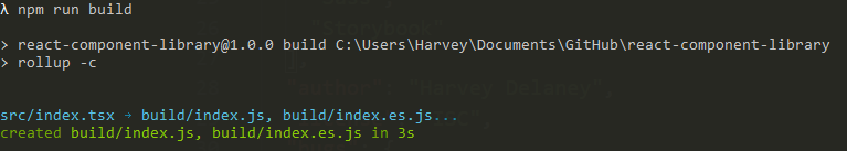
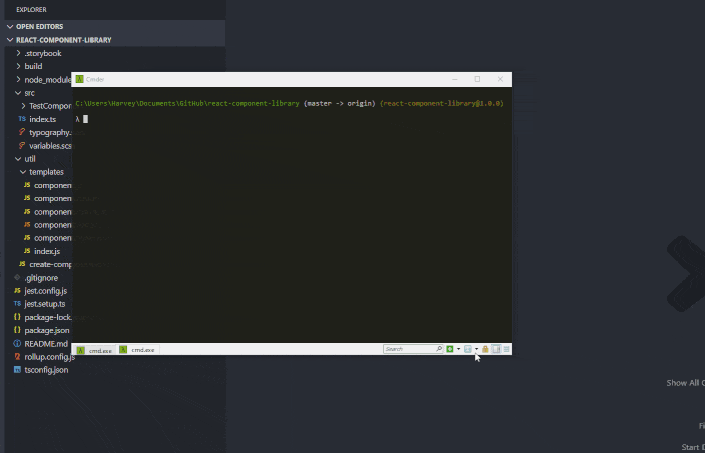
Now by running npm run build you should see Rollup do it's thing and create a /build folder that will contain the compiled (CJS and ESM) component library, ready to be published to an NPM registry:
Note: you might want to create a .gitignore file and add node_modules and build to it.
Adding Storybook
We will be adding Storybook to our component library manually.
Install Storybook for React, it's core dependencies (Babel) and Webpack loaders:
npm install --save-dev @storybook/react @babel/core babel-preset-react-app babel-loader sass-loaderStorybook uses Webpack to serve and load JS modules. It ships with default config outlined here. Since we are using Sass and TypeScript, we'll need to extend the default config with additional Webpack rules to get Storybook working with our library.
Yes, it's less than ideal that we have to configure both Webpack and Rollup for our component library. Until Storybook supports Rollup or Webpack becomes the recommended module bundler for JavaScript libraries, we'll have to stick with this!
In .storybook/main.js and add:
const path = require("path");

module.exports = {
  stories: ["../src/**/*.stories.tsx"],
  // Add any Storybook addons you want here: https://storybook.js.org/addons/
  addons: [],
  webpackFinal: async (config) => {
    config.module.rules.push({
      test: /\.scss$/,
      use: ["style-loader", "css-loader", "sass-loader"],
      include: path.resolve(__dirname, "../")
    });

    config.module.rules.push({
      test: /\.(ts|tsx)$/,
      loader: require.resolve("babel-loader"),
      options: {
        presets: [["react-app", { flow: false, typescript: true }]]
      }
    });
    config.resolve.extensions.push(".ts", ".tsx");

    return config;
  }
};
Here, we're instructing Storybook where to find our stories, specifying our Stoprybook addons (none so far, but check out all the addons available) and using sass-loader + babel-loader to compile our Sass + TypeScript files.
Storybook has style-loader and css-loader as dependencies already. Hence why we only had to install sass-loader.
We also need to create package.json script entries for Storybook:
...
  "scripts": {
    ...
    "storybook": "start-storybook -p 6006",
    "storybook:export": "build-storybook",
    ...
  }
...storybook:export is optional! It allows you to export Storybook as static files that can can be served anywhere. This is helpful for showing off your components to non-technical members of your team. You can chuck the files into an S3 Bucket, use GitHub pages or spin up a custom ExpressJS server - the choice is yours!
That's it! Storybook is now configured for our component library.
Now, we have to create stories for TestComponent. Open src/TestComponent/TestComponent.stories.tsx and place:
import React from "react";
import TestComponent from './TestComponent';

export default {
  title: "TestComponent"
};

export const Primary = () => <TestComponent theme="primary" />;

export const Secondary = () => <TestComponent theme="secondary" />;
This is a very basic story, showing the two variants of our component.
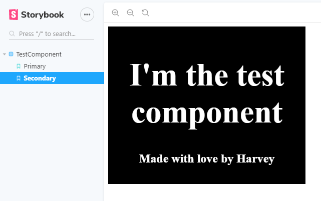
Now run npm run storybook and Storybook will run it's magic and load up your components at http://localhost:6006. Storybook should look like:
Adding Jest and React Testing Library
Maintaining a high level of test coverage on components is extremely important for your component library. We need to have confidence that when we make changes to our components that we won't be breaking how the component is being expected to behave in another project. For testing our React components, we will be using Jest and React Testing Library.
Start by installing Jest, React Testing Library:
npm i --save-dev jest ts-jest @types/jest identity-obj-proxy @testing-library/react @testing-library/jest-domIn jest.config.js add:
module.exports = {
  roots: ["./src"],
  setupFilesAfterEnv: ["./jest.setup.ts"],
  moduleFileExtensions: ["ts", "tsx", "js"],
  testPathIgnorePatterns: ["node_modules/"],
  transform: {
    "^.+\\.tsx?$": "ts-jest"
  },
  testMatch: ["**/*.test.(ts|tsx)"],
  moduleNameMapper: {
    // Mocks out all these file formats when tests are run
    "\\.(jpg|ico|jpeg|png|gif|eot|otf|webp|svg|ttf|woff|woff2|mp4|webm|wav|mp3|m4a|aac|oga)$":
      "identity-obj-proxy",
    "\\.(css|less|scss|sass)$": "identity-obj-proxy"
  }
};
The creator of react-testing-library has also created a library called jest-dom. It extends Jest, providing a number of helpful Jest matchers like toHaveClass, toHaveAttribute, toBeDisabled and so on. If you want to add it, in jest.setup.ts add:
import "@testing-library/jest-dom";
And add two new scripts in package.json to run the tests:
...
"scripts":
    {
        ....
        "test": "jest",
        "test:watch": "jest --watch",
        ....
    }
... test should be used on your CI/CD pipeline and test:watch should be used when you're running your tests locally (they will re-run whenever a file is changed).
Then in TestComponent.test.tsx create two simple tests:
import React from "react";
import { render } from "@testing-library/react";

import TestComponent from "./TestComponent";
import { TestComponentProps } from "./TestComponent.types";

describe("Test Component", () => {
  let props: TestComponentProps;

  beforeEach(() => {
    props = {
      theme: "primary"
    };
  });

  const renderComponent = () => render(<TestComponent {...props} />);

  it("should have primary className with default props", () => {
    const { getByTestId } = renderComponent();

    const testComponent = getByTestId("test-component");

    expect(testComponent).toHaveClass("test-component-primary");
  });

  it("should have secondary className with theme set as secondary", () => {
    props.theme = "secondary";
    const { getByTestId } = renderComponent();

    const testComponent = getByTestId("test-component");

    expect(testComponent).toHaveClass("test-component-secondary");
  });
});
After running npm run test:watch you should see Jest run and output:
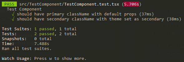
Indicating we have set it up correctly!
Final NPM Config
After going through these steps, your package.json should look like:
{
  "name": "react-component-library",
  "version": "1.0.0",
  "main": "build/index.js",
  "module": "build/index.esm.js",
  "files": [
    "build"
  ],
  "scripts": {
    "build": "rollup -c",
    "test": "jest",
    "test:watch": "jest --watch",
    "storybook": "start-storybook -p 6006",
    "storybook:export": "build-storybook"
  },
  "peerDependencies": {
    "react": ">=16.8.0",
    "react-dom": ">=16.8.0"
  },
 "devDependencies": {
    "@babel/core": "^7.9.0",
    "@rollup/plugin-commonjs": "^11.1.0",
    "@rollup/plugin-node-resolve": "^7.1.3",
    "@storybook/react": "^5.3.18",
    "@testing-library/jest-dom": "^5.5.0",
    "@testing-library/react": "^10.0.2",
    "@types/jest": "^24.0.24",
    "@types/react": "^16.9.12",
    "@types/react-dom": "^16.9.8",
    "babel-loader": "^8.1.0",
    "babel-preset-react-app": "^9.1.2",
    "identity-obj-proxy": "^3.0.0",
    "jest": "^24.9.0",
    "node-sass": "^4.14.1",
    "react": "^16.13.1",
    "react-dom": "^16.13.1",
    "rollup": "^1.27.4",
    "rollup-plugin-copy": "^3.3.0",
    "rollup-plugin-peer-deps-external": "^2.2.0",
    "rollup-plugin-postcss": "^3.1.2",
    "rollup-plugin-typescript2": "^0.27.0",
    "sass-loader": "^8.0.0",
    "ts-jest": "^24.2.0",
    "typescript": "^3.7.2"
  }
}
Publishing the Component Library
To publish our library, we first have to make sure that we have run Rollup (npm run build) and the transpiled/bundled library code exists under /build. We can utilise the NPM script prepublishOnly to make sure build is run before publish occurs. Add the following to package.json:
...
"scripts": {
    ...
    "prepublishOnly": "npm run build"
  },
...Next, we have to choose an NPM registry to which we want to upload our library to. The easiest option is to use the public NPM registry. Other private (self hosted) alternatives are Verdaccio and ProGet. Create an account, then using those credentials (username and password) log into NPM by running: npm login.
Next, make sure the name of the package in package.json is something you desire and the version is 1.0.0 (to begin with):
{
  "name": "react-component-library",
  "version": "1.0.0",
  ...
}
The name in this article uses react-component-library which has already been taken - so choose something unique. For example, I've used harvey-component-library.
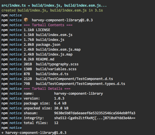
Now run:
npm publishAny files that are under the directories outlined in files in package.json will be uploaded to the registry. For us, this will be all the files under /build which is the output from Rollup. You should see:
Anytime you want to update your library, you will have to increment the version in package.json following the Semantic Versioning guide. For example, if I had a "patch" update, I'd change the version from 1.0.0 to 1.0.1 and run npm publish.
Using the Component Library
Installing from NPM Registry
Let's say we've followed the above steps to publish our component library to NPM at: https://www.npmjs.com/package/harvey-component-library. We would install the component library as a dependency like we would any other NPM package:
npm install --save harvey-component-libraryInstalling Locally
We probably don't always want to have to publish and then install the component library to see new updates when using the library in other React projects. Fortunately, we don't have to publish the component library to an NPM registry before installing our component library and test out our components.
Let's say you had a React project on your local machine called harvey-test-app. In harvey-test-app run (making sure the path is correct to your component library):
npm i --save ../react-component-library This will install your local instance of the component library as a dependency to harvey-test-app! This establishes a symlink from the component library to the dependency in the consuming project. Anytime an update is made to the library, it will immediately be reflected in the consuming project. Read more about NPM link here.
Using the Components
For either option, you would then go into your project consuming the component library (harvey-test-app) project and import our TestComponent like:
import React from "react";
import { TestComponent } from "react-component-library";

const App = () => (
    <div className="app-container">
        <h1>Hello I'm consuming the component library</h1>
        <TestComponent theme="primary" />
    </div>
);

export default App;
Running harvey-test-app should now successfully render our TestApp component!

Check out this Code Sandpit snippet to see how easy it is to use the component!
Adding More Components
The way we've structured our project allows for any number of components to be added. You can copy the TestComponent folder, rename and then build out your new component.
Update 26/04/2020: I found the above steps to create a new component were cumbersome and time consuming. I decided to create a Node script that helps generation of new components:
For both approaches, make sure you export your new component in index.ts otherwise it won't be picked up and bundled by Rollup.
Introducing Code Splitting (optional)
We can introduce code splitting that enables projects consuming our library to import one or a few components, instead of the whole library. This can help us achieve smaller bundle sizes in projects using our component library without tree shaking.
You'll only see benefit from this if you have a large component library with many components OR if the projects consuming the library do not use modern module bundlers that can perform tree shaking.
We will be utilising Rollup's Code Splitting functionality to help us achieve this.
Note 1: I opted to only target one module format (CJS). This reduces one level of nesting when importing components (import X from library/build/cjs/component/component -> import X from library/build/component/component). You can still target two formats if you want.
Note 2: It's also worthwhile to introduce an index.ts file to each of our components. The index.ts file can either contain our component, or import/export the component from another file. This reduces another level of nesting when importing components (import X from library/build/component/component -> import X from library/build/component). Here is an example.
Note 3: I've found that there is an issue with Rollup code splitting and bundling dependencies from node_modules. As such, I've removed @rollup/plugin-node-resolve when code splitting until I can find a better solution.
There are some changes we have to make to rollup.config.js and package.json. First, in rollup.config.js, update input, output and perserveModules to:
{
  input: ["src/index.ts", "src/TestComponent/TestComponent.tsx"],
  output: [
    {
      dir: "build",
      format: "cjs",
      sourcemap: true
    }
  ],
  preserveModules: true,
  ...
}
Instead of specifying one index file, we're telling Rollup to use a number of index files. This is how we instruct Rollup to perform code splitting. Add a path to all components you want to be split in the array.
We can use @rollup/plugin-multi-entry and provide appropriate file name patterns instead of having to add each of our components.
Setting preserveModules to true is required to maintain the directory/file structure of our components after being compiled. Without it, Rollup won't co-locate our compiled components and their associated type files correctly:
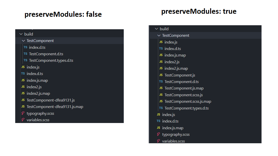
We're updating output.file to output.dir because Rollup bundles with code splitting, it produces output in multiple files/directories instead of one file.
In package.json remove the module entry as we're only shipping CJS:
{
  ...,
  "main": "build/index.js"
  "files": [
    "build"
  ],
  ...
}That's it!
After building/publishing/installing our updated component library, we should be able to import components in two ways:
import { TestComponent } from 'react-component-library';OR
import TestComponent from 'react-component-library/build/TestComponent';Option A will import TestComponent along all the other components available in the library. This will increase your overall bundle size (assuming there's no tree shaking).
Option B will only import TestComponent. This approach can significantly reduce the amount of code that is sent to the client.
See the component library with code splitting on this branch. Or checkout this commit to see what changes are required.
Further Steps
Setting up a Private NPM Registry, CI Pipeline and Consuming the Library
The next steps to get this component library was to setup a private NPM registry and pipeline which automatically publishes/maintains library versioning. I'll be covering this aspect in another blog post which you can read at: Setting up a Private NPM Registry and Publishing CI/CD Pipeline
Maintaining Code Quality in your Component Library
As this component library will likely be contributed by other engineers on your team, you'll probably want to maintain a high level of code quality by using static code analysis. Follow along with: Maintaining Code Formatting and Quality Automatically to help achieve this.
GitHub Repository
Again, I've created a GitHub repository with all the code necessary to create your own component library. Feel free to clone, fork or star it if it helps you!
 GitHub